Typeface Variation – Function and Aesthetics
When reading a document, readers perceive not only the overall text but also the features within it, such as the typography. Used properly, typography can have an immense impact on the success of a design. For this reason, it is at the centre of design practice.
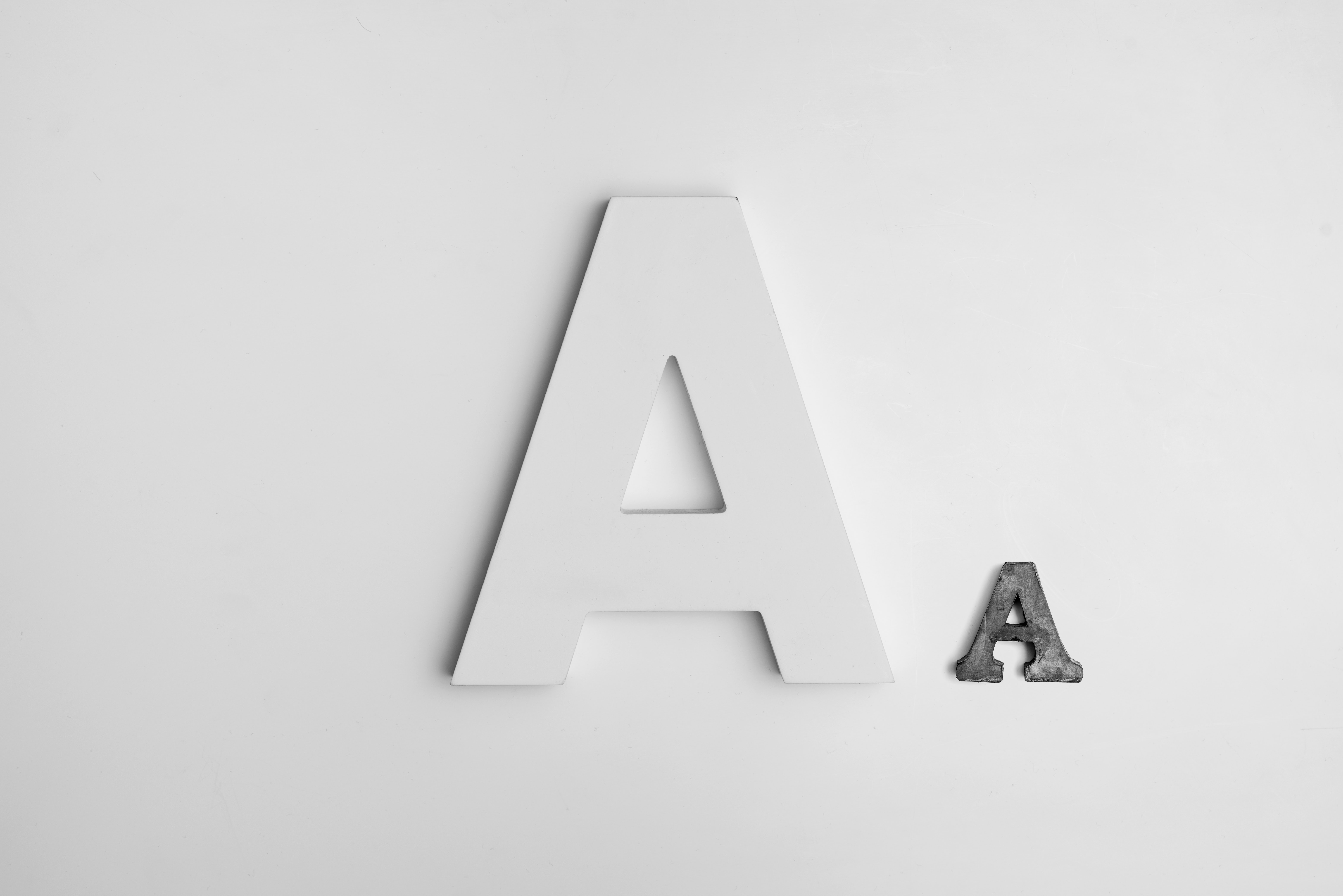 Photo credit: Alexander Andrews on Unsplash
Typography is a term that encompasses the style and appearance of text. Within it, you find typefaces, which, as explained by Royal van Horn is; ‘a particular design of type’ (2004, p. 727), often accompanied by terms like typeface families (a group of typefaces) and typeface classifications (groups of typefaces sharing similar characteristics). Typefaces are about function, but also aesthetics. The goal of a designer is to successfully “translate” a message into visual content. Typefaces can help achieve that.
All typefaces have different personalities, and can express different moods. Therefore, selecting typefaces requires some effort. What typeface the designer chooses is reliant on the medium, context and message. For example, a fourth-grade teacher will most likely not look for or use the same typeface as an academic lecturer.
Typefaces can be divided into five categories: serif, slab-serif, sans-serif, script and decorative. Within these there are variations of fonts, all of which have different personalities, and are most often used for entirely different purposes.
Serif
The serif typeface is distinctive by the way that it is shaped – with small strokes at the end of the letterforms. The most classic and original out of the five typefaces – serif is what Reid describes as ‘ubiquitous’ in our day to day life (2018). Serif fonts are present in most printed books and documents of which we read or open. They are characterized by a more conservative design, and are mainly used by designers who wish to present a more sophisticated layout. The most popular serif font is Times New Roman, but other well-known and well-used examples are Georgia and Garamond.
Sans-serif
Opposite of serif, we find the sans-serif typeface – characterized by its lack of small strokes. Sans-serif literally means without (sans) serif (van Horn, 2004, p. 727). Compared to serif, this typeface has a more modern and clean look to it. With their clear, straight-lines – the sans-serif fonts are considered to be the most efficient, honest and modern choice for designers. However, although they are very readable, they work better in logos and headlines than long paragraphs (Reid, 2018). Well-known fonts are Helvetica and Arial.
Slab-serif
Slab-serif – the louder typeface of the group. Defined by its bold and more angular or rounded features (Tailorbrands.com, n.d.). Unlike serif and sans-serif – slab-serif portrays more confidence and boldness, which communicates a sense of importance to viewers. The typeface works well for posters and billboards, examples of fonts including Clarendon, Courier and Rockwell.
Script
Script is a “hand-writing” style typeface. The script fonts are immediately separated from the other typeface fonts by their swashes, better describes as “over-the-top” curls (Reid, 2018). Due to the way in which they replicate calligraphy and handwriting, script fonts are often used for invitations or romance book covers – to reinforce the personal nature of the text. However, unlike sans-serif fonts, script fonts are harder to read – and in result, must be used sparingly. Well-known script fonts are Lucida Calligraphy and Zapfino.
Decorative
The decorative fonts are generally more unique and appealing than the other typeface fonts. Known for their emphasize on originality, the decorative fonts allow more flexibility to designers as they are often tailored to fit a certain industry or need. They are rarely used for longer pieces of writing, and work best for use in logos. For this reason, decorative fonts are often used by companies that wish to communicate their specific brand (tailorbrands.com, n.d.)
Ultimately, through selecting typefaces a designer can convey different messages, emotions or ideas. It is one of the most fundamental factors in communicating the meaning of a design (Marshall, Meachem, 2012). And if there is a mismatch between your typeface and message, the consequence can result in a visual disconnect for the readers, causing your design to have less impact.
References:
Cullen, K. (2012) Design Elements Typography Fundamentals: A Graphic Style Manual for Understanding How Typography Affects Design. Beverly, MA: Rockport.
Marshall, L. and Meachem, L. (2012) How to use type. London: Laurence King.
Reid, M. (2018) ‘The 5 types of fonts and how to use them - 99designs’. [online] 99designs. Available at: https://99designs.co.uk/blog/tips/types-of-fonts/ [Accessed 28 Feb. 2020].
Tailor Brands. (n.d.) ‘Different Types of Fonts, and When to Use Them’. [online] Available at: https://www.tailorbrands.com/logo-maker/types-of-fonts [Accessed 28 Feb. 2020].
van Horn, R. (2004) ‘Typefaces’ 85(10), pp. 727–795.